Dental Supplier Group
Face-lifting a B2B E-commerce platform to craft
a user-focused interface by making navigation
intuitive, optimizing purchasing journey, and
driving business impact.
Customer
Dental Supplier GroupPlatform Type
B2B E-commerceTeam
PM, UX/UI, Front-endIndustry
Dental SuppliesUsers
Dental clinics & DentistsChallenge
Inefficient workflowsHeadquarter
Sydney, AustraliaMarket Coverage
Australia, New ZealandTimeline
3.5 monthsUX/UI Design that drives growth
We turned a legacy platform into modern, scalable solution ready to meet evolving demands and user expectations.
The result: increased purchases, better customer retention, and a stronger competitive edge for our client.
User Experience
Find products 25% faster
- Sleek UI reduces cognitive load
- Easier product discovery
- Streamlined user flows
- User-Friendly purchasing process
Customer Benefits
30% higher customer NPS
- Increased trust in the platform
- Repeat usage
- Easier decision-making
- Reduced Support Needs
Business Impact
22% increase in repeat purchases
- Attract & Retain Customers
- Increased purchases
- Stronger competitive edge
- Future-Ready redesign
Customise Metronic to meet B2B user needs

Our Approach in Three phases
Discovery
3 weeks
Conducted UX research, gathered feedback, analyzed issues, and planned project goals.
UI Design
6 weeks
Created layouts, refined visuals, and ensured seamless, user-friendly interface designs.
Front-end Development
4 weeks
Built features, fixed bugs, tested thoroughly, and ensured mobile-friendly performance.
Establish the Foundation
Brainstorming Session
Stepping into Ecommerce World
For B2B marketplaces like Dental Supplier Group, we start by understanding the full ecosystem—buyers, suppliers, and workflows. UX research reveals what drives purchasing decisions, and where pain points are, helping us shape smart solutions from day one.
Our research methodology
Ongoing discovery of Dental Supplies Marketplace
Our approach to the discovery phase - and the entire project - was a continuous loop of exploration. This allowed us to craft a platform that is easy to navigate, built to scale, and ready to expand with client’s business.
Business model & Business goals
Client highlighted the strategic need for a contemporary design that r..
Platform audit
Our team conducted a detailed evaluation of the platform against desig..
Purchase behaviours
We studied customer workflows on the current platform and investigated..
Client collaboration
We established a feedback loop with the client that was continuously h..
Industry insights
We collected valuable data on end-users and suppliers in the dental su..
Identify Challenges
Found barriers that slowing them down
Why you should care?
Redesign Priorities
Defined a roadmap to modernize the interface and improve usability.CTA Boost Conversions
Clear, bold calls to action increase purchases in e-commerce.Details Drive Purchases
Clear descriptions and quality images boost trust, reduce confusion.Optimized Sales
Good product display improves perception and lifts sales success rates.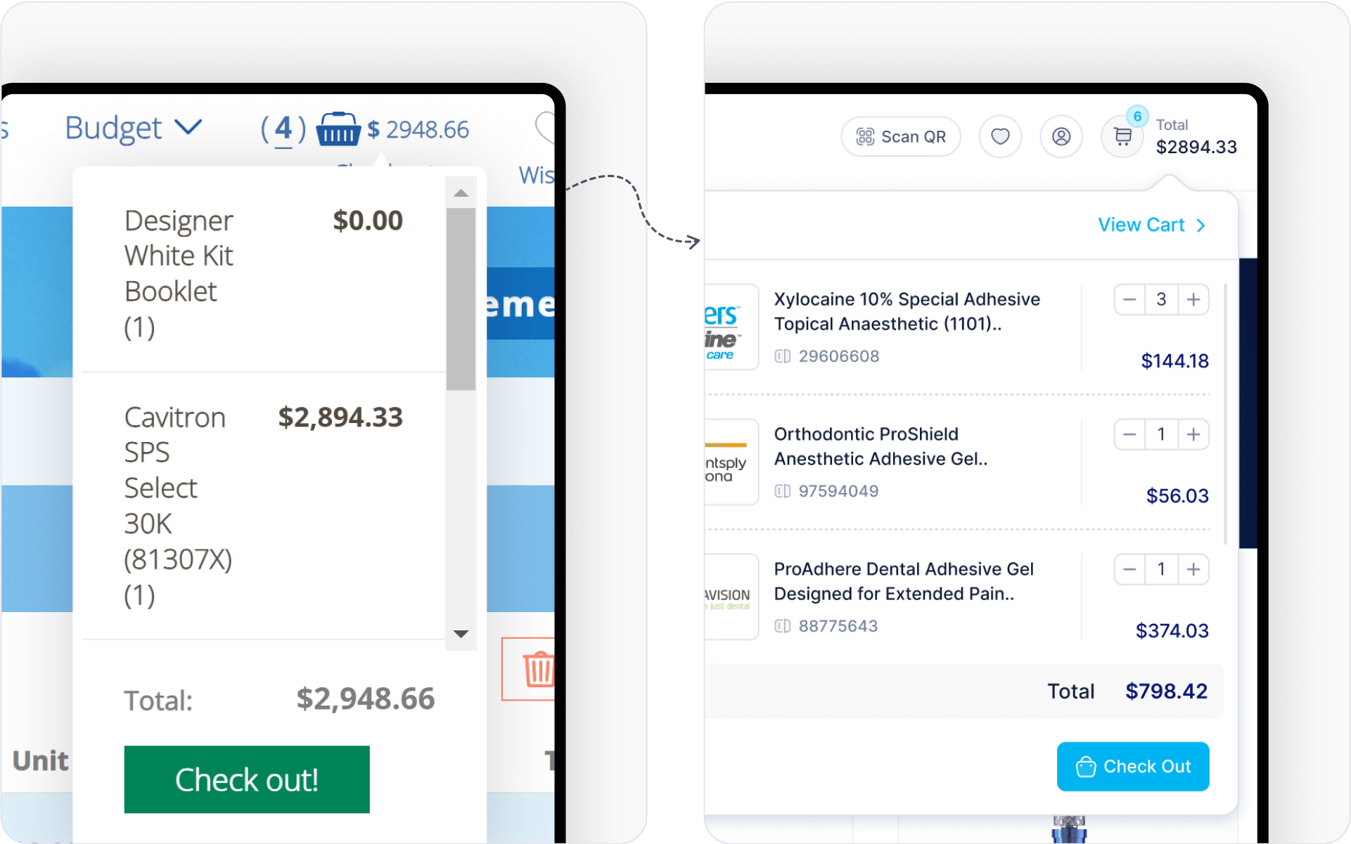
Turning Plans into Action
UX research guides UI goals with data. A new platform fits business needs, boosts use, and makes tasks easier.
Research-based choices help users act fast. Smooth flows and clear layouts grow business while keeping things simple and useful.
We address two distinct types of interactions: Customers (buyers who may not use the product) and Users (end-users of the product). At KeenThemes Studio, we enhance engagement by personalizing content for both groups, rather than altering the interface, ensuring a tailored experience for each.
Actions
Design System
Clean UI keeps tasks simple. Clear paths, smart layouts, and smooth flows help users act fast and stay focused.
Sharp visuals and neat space boost use. Every part guides actions, cuts clutter, and keeps things clear and easy.
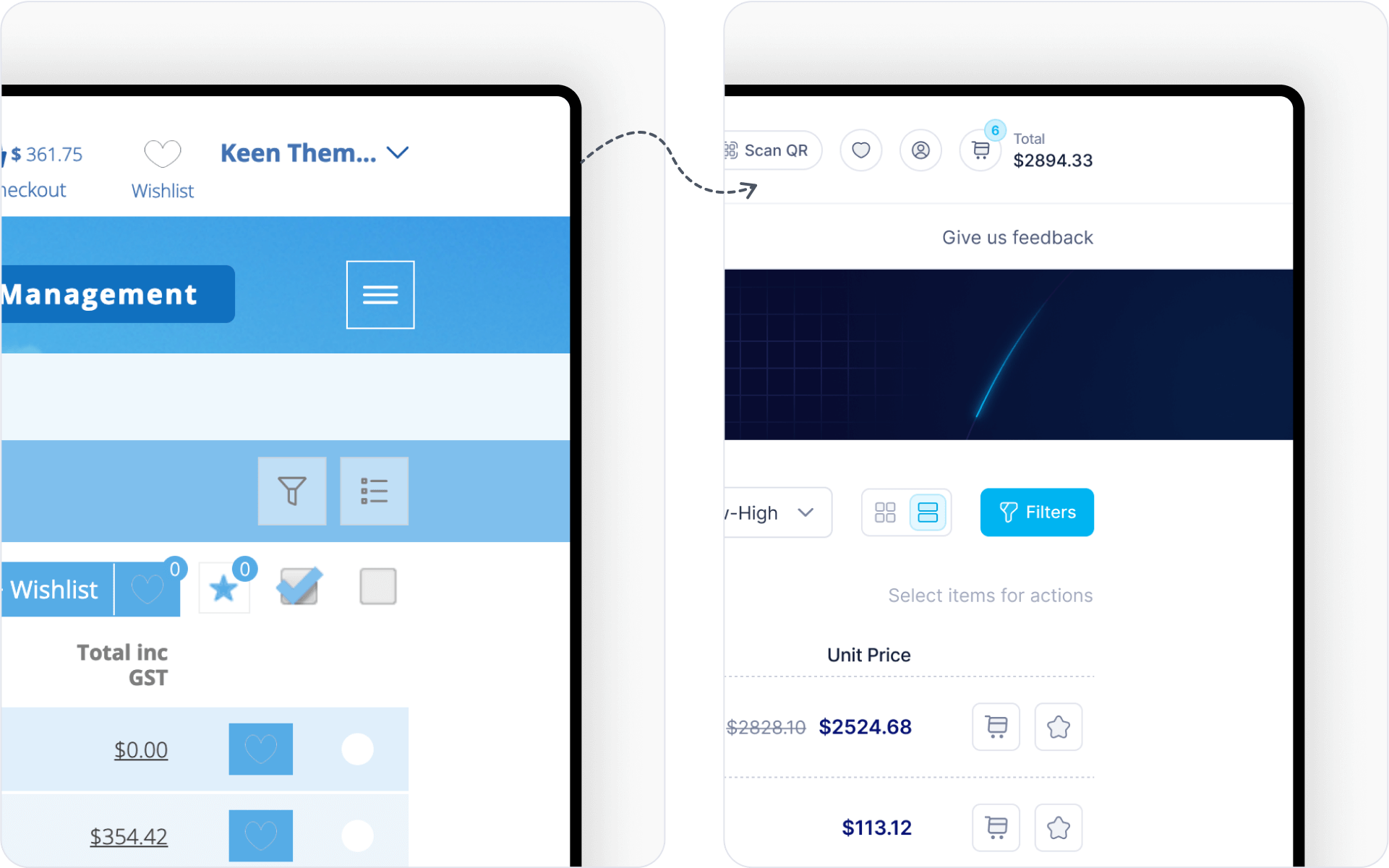
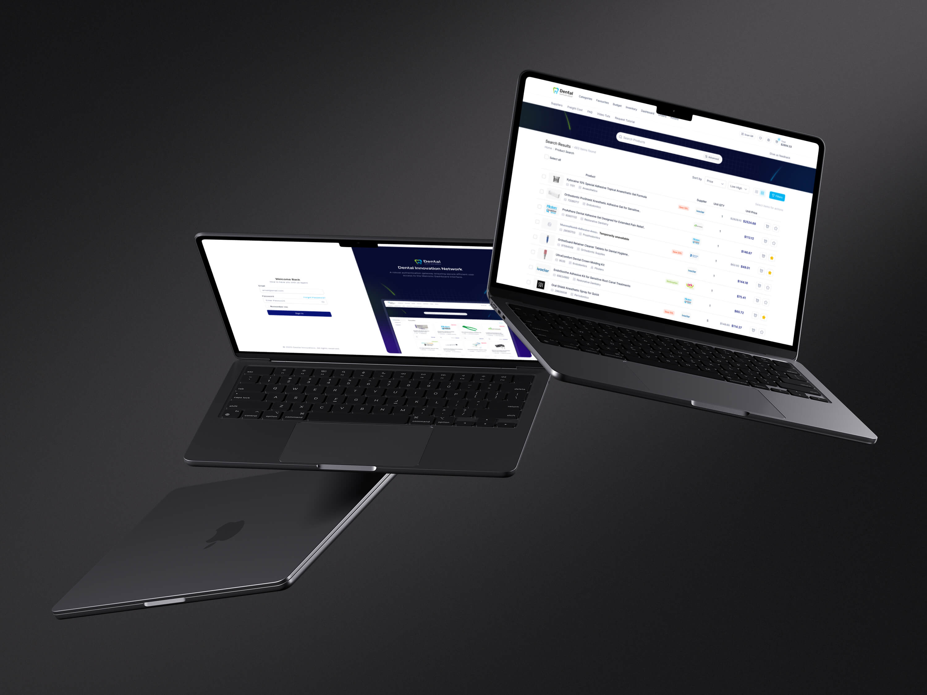
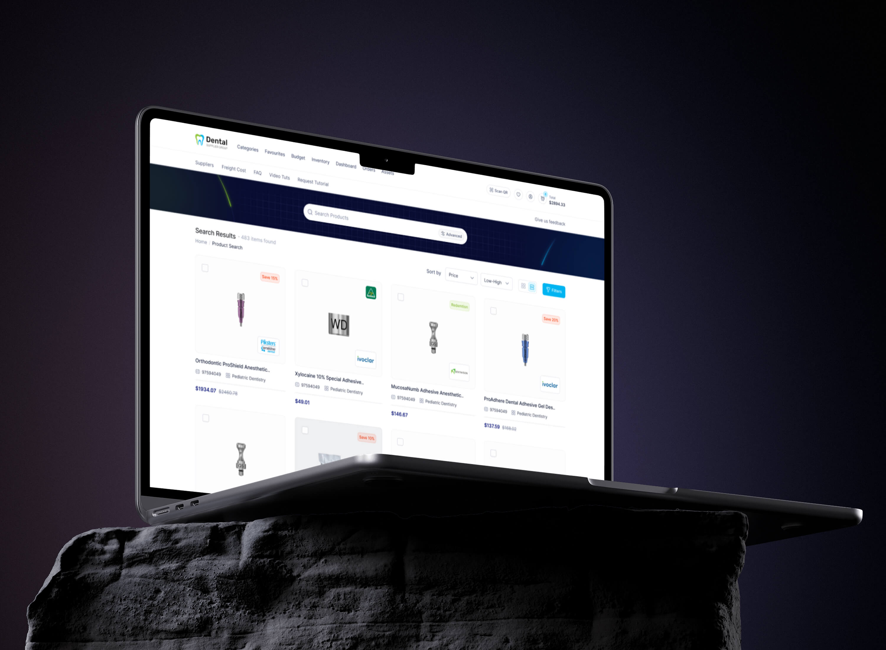
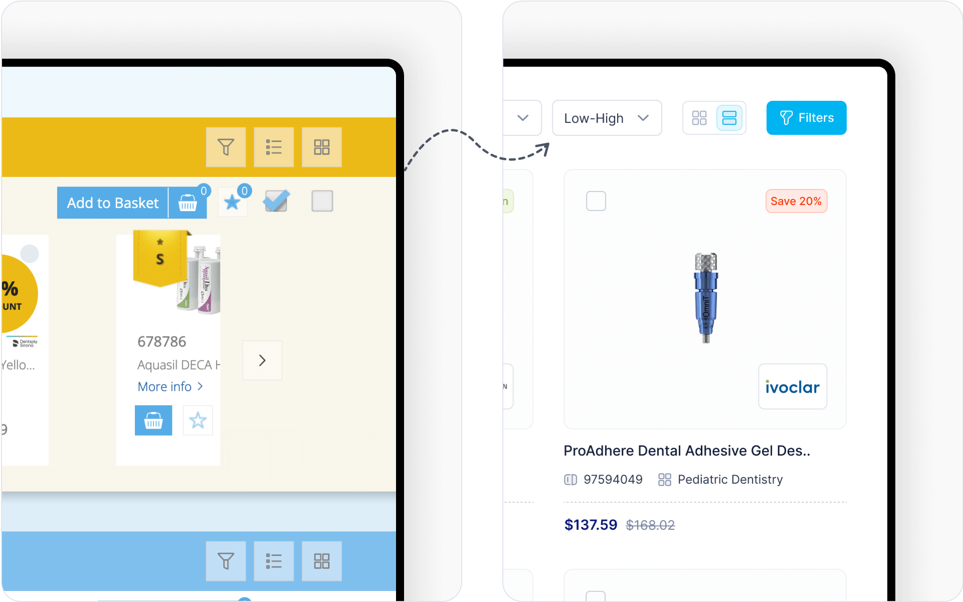
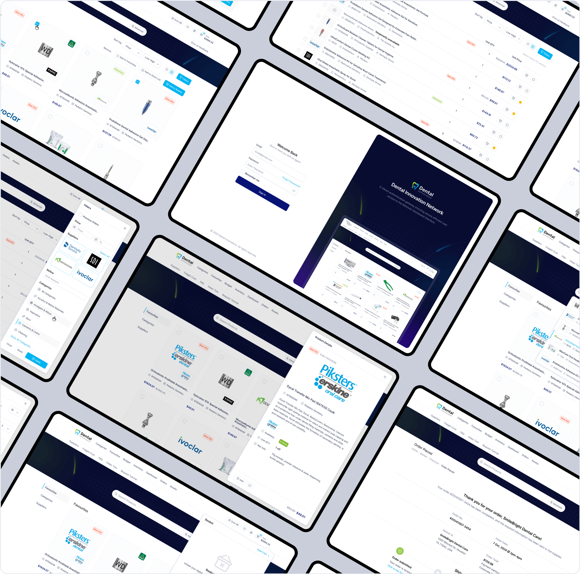
 Redesigning the B2B platform to enhance UX, modernize the interface, and ensure responsive performance across mobile, tablet, and desktop.
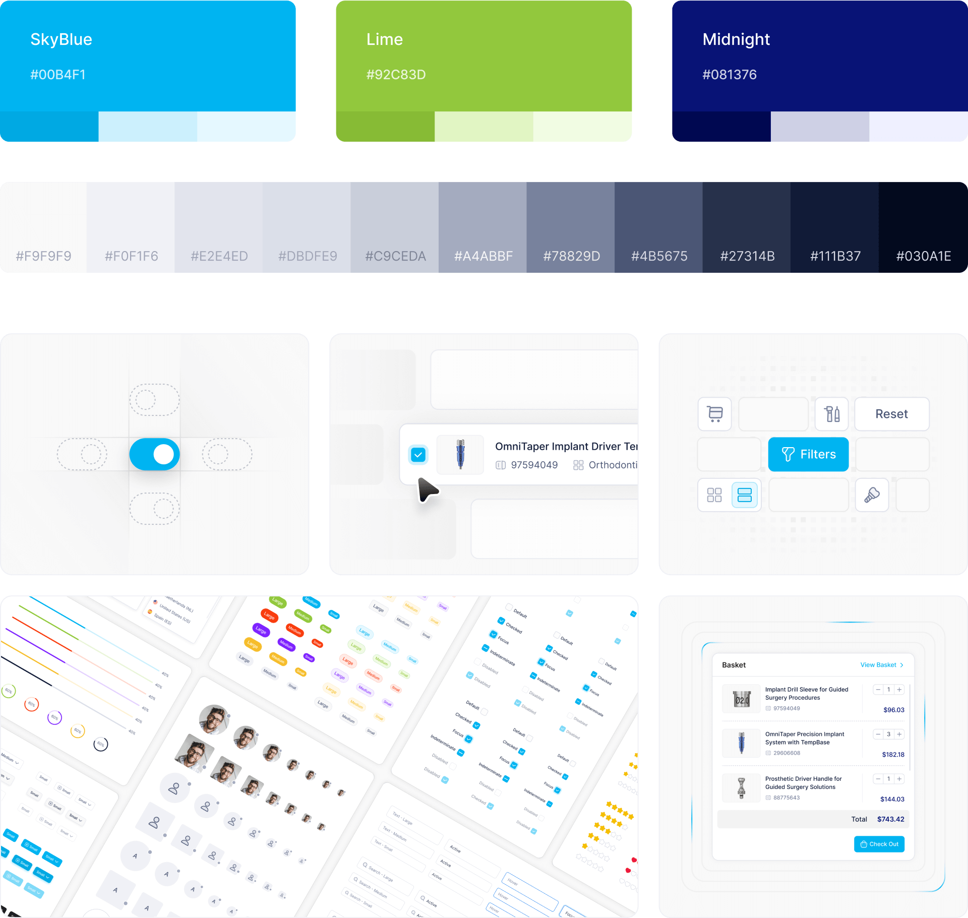
40 Custom Icons
Made 40 custom icons for clear display. Unique symbols help users find categories fast while keeping the interface clean.
User-Centered UI That Works
Built on 18 years of experience, our UI follows modern principles, keeping layouts sleek, trends fresh, and user flows smooth and intuitive.
Expertise shapes every detail—clean design, latest trends, and a polished look. Every pixel ensures easy use, clear actions, and lasting appeal.
Execution: Transforming UI into Code
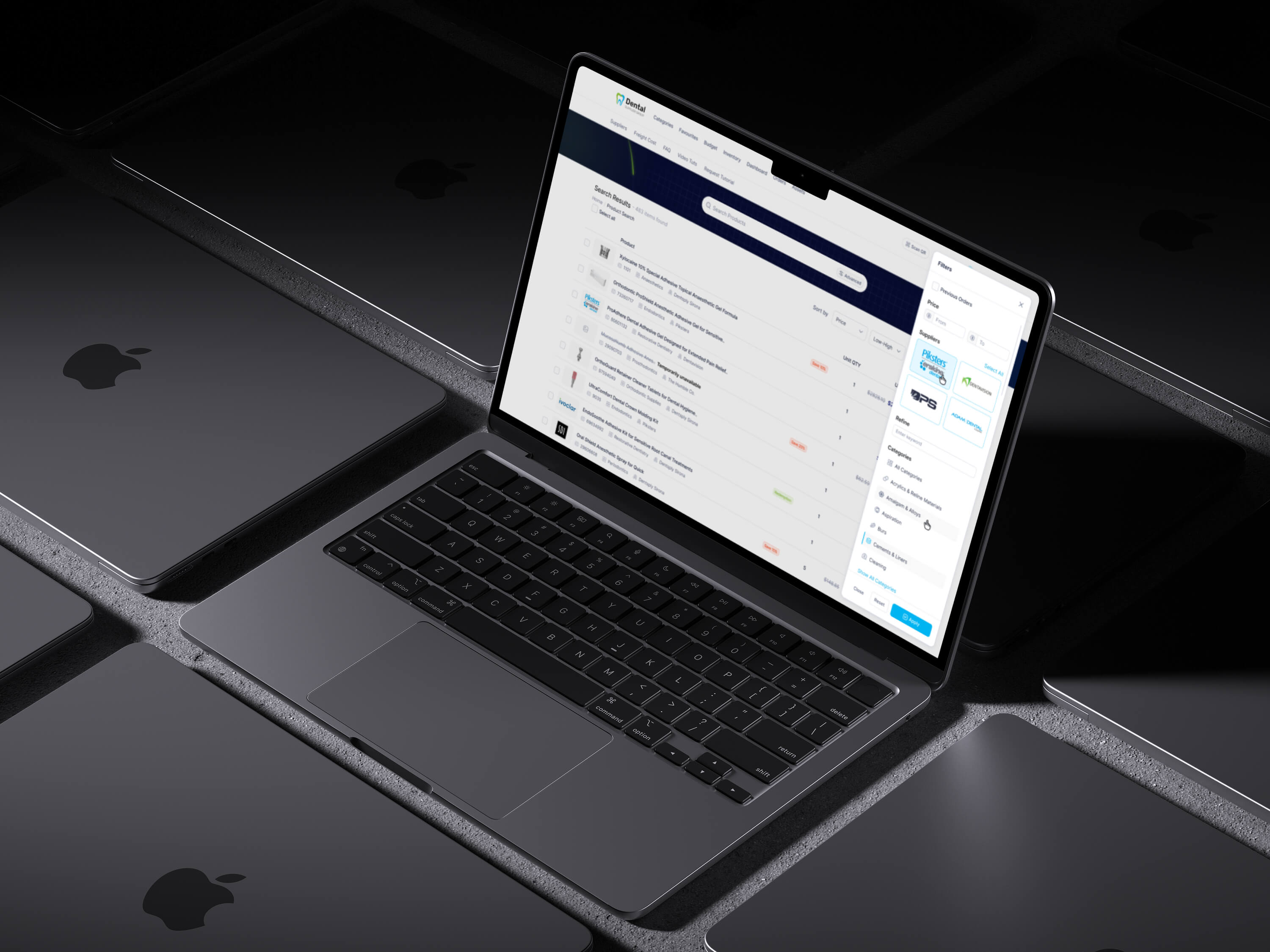
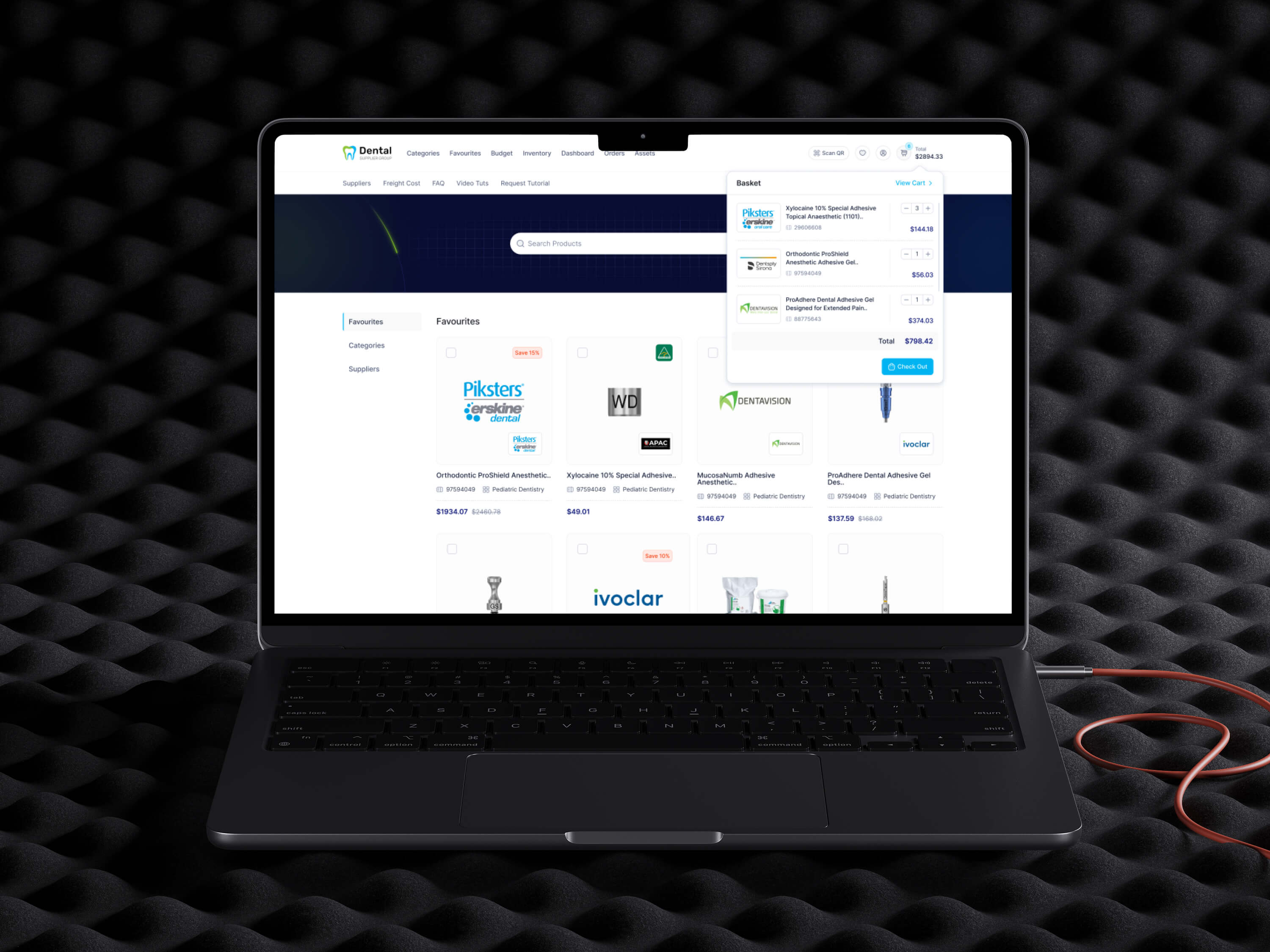
Transforming design into a fully functional UI with clean, efficient code, ensuring responsiveness, scalability, and smooth user interactions.
Developing a seamless, high-performance interface with modular components, optimized code, and a focus on responsiveness and usability.
Built from Figma
Converted UI designs into HTML using Metronic 9 & Tailwind for seamless implementation.
Component-Driven Approach
Developed modular components for flexibility, reusability, and efficient UI scaling across devices.
Smooth Integration
Ensured clean, maintainable code with optimized performance for long-term scalability and compatibility.
Performance Optimization
Improved loading speed, reduced asset sizes, and fine-tuned responsiveness for a seamless user experience.
Delivering Measurable Success
Original Look
Outdated UI, slow performance, and poor navigation led to user frustration, reduced engagement, and lower conversions.
Outcoime
Optimized UI, faster performance, and seamless navigation improved user experience, increased engagement, and boosted conversions.